

Penny W. Stamps Wayfinding
Penny W. Stamps Wayfinding
Project Overview
Project Overview
This project focused on redesigning the school’s wayfinding system to establish visual consistency, improve clarity, and create a cohesive navigation.
The Penny W. Stamps School of Art and Design struggles with an outdated and inconsistent signage and wayfinding system. The lack of a clear visual and structural system makes navigation confusing, particularly for new students and visitors. As a result, users often rely on trial and error rather than intuitive cues, creating friction in how people experience and move through the school.
Problem
Problem
The Penny W. Stamps School of Art and Design struggles with an outdated and inconsistent signage and wayfinding system. The lack of a clear visual and structural system makes navigation confusing, particularly for new students and visitors. As a result, users often rely on trial and error rather than intuitive cues, creating friction in how people experience and move through the school.
The Penny W. Stamps School of Art and Design struggles with an outdated and inconsistent signage and wayfinding system. The lack of a clear visual and structural system makes navigation confusing, particularly for new students and visitors. As a result, users often rely on trial and error rather than intuitive cues, creating friction in how people experience and move through the school.


Design Solution
Design Solution
Color
Color


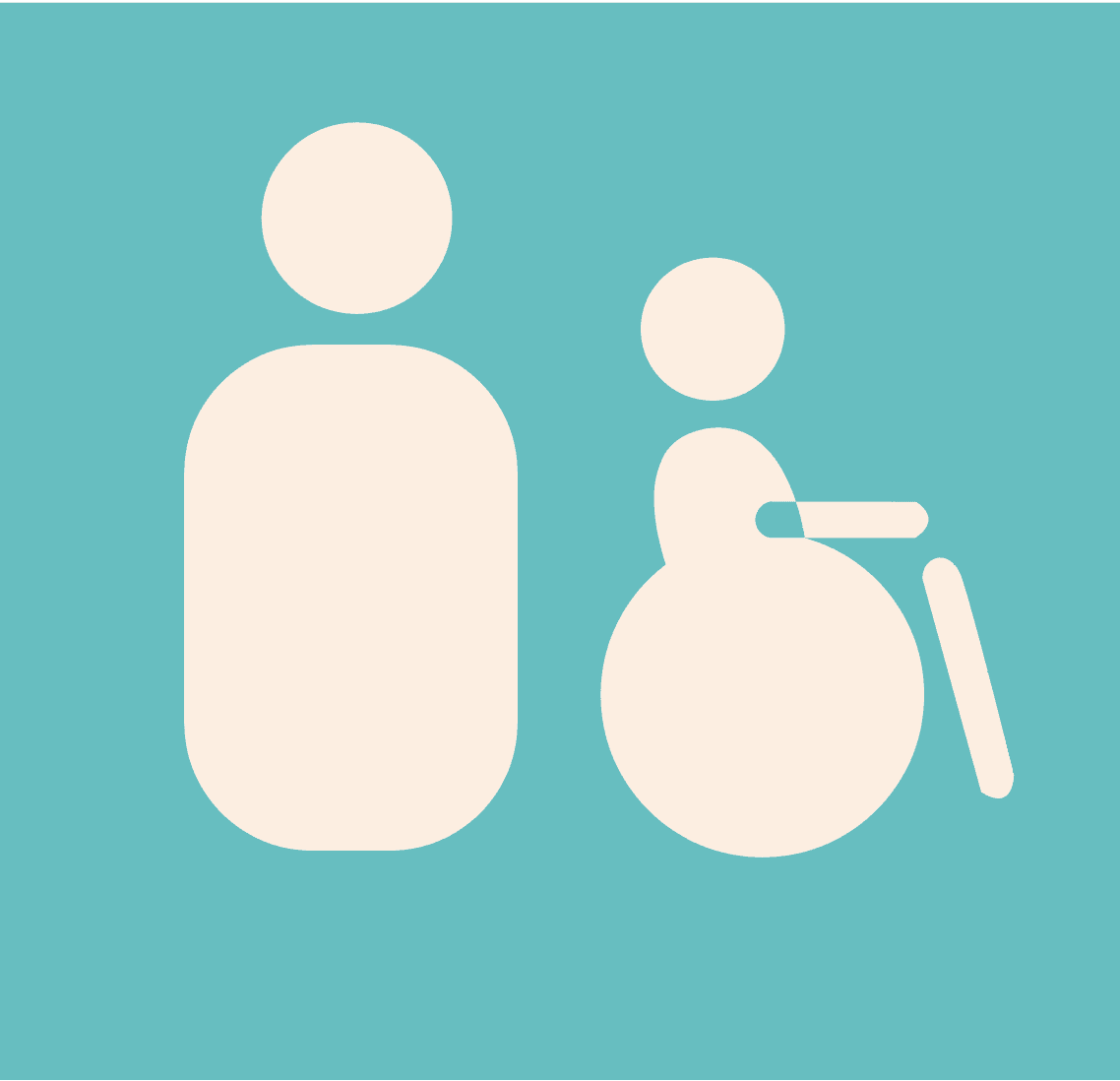
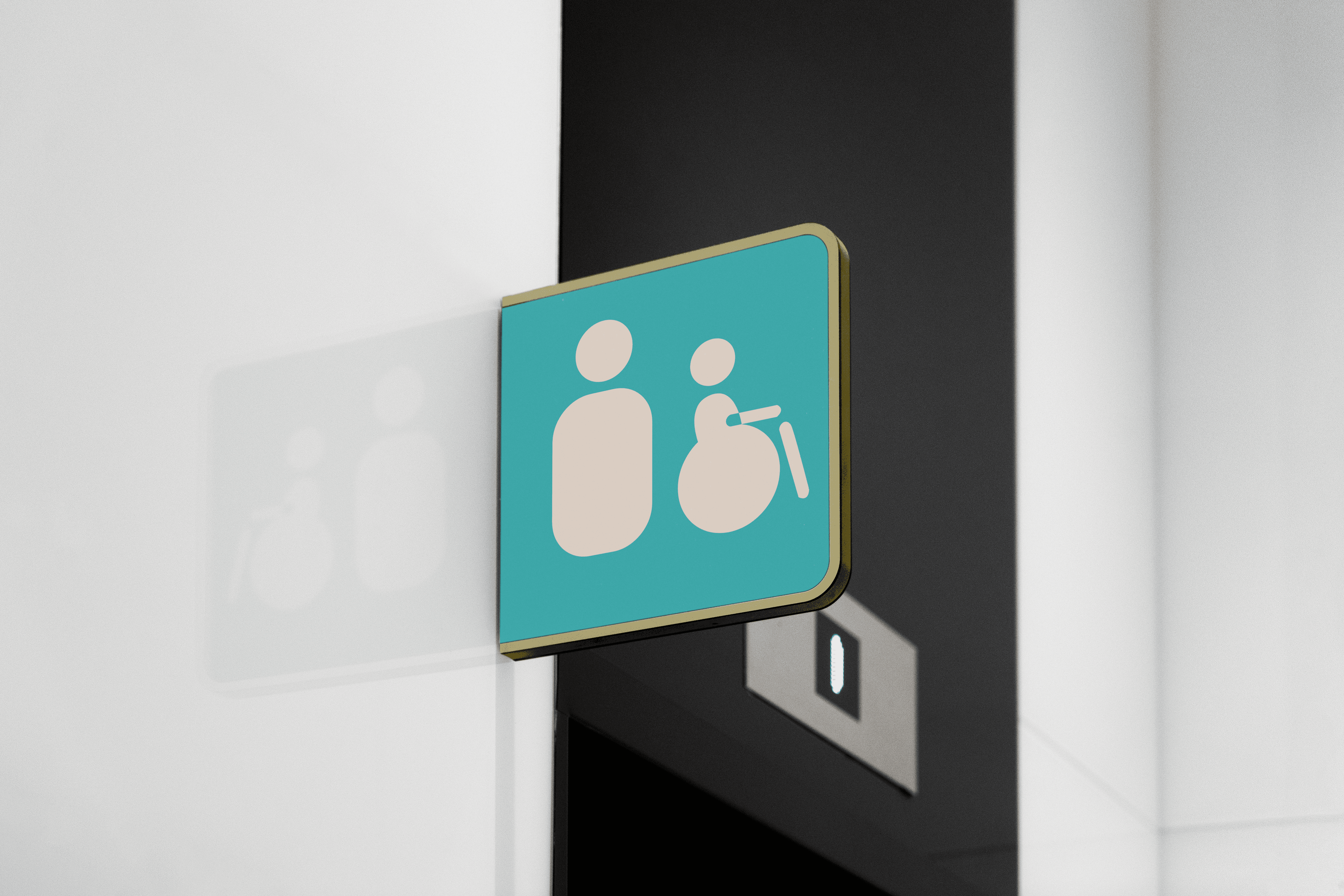
Icongraphy
Icongraphy
The icons were designed for based on my font, DINousar. I took inspiration from the roundness and boldness to make them visible from distance as well.
The icons were designed for the based on my font, DINousar. I
took inspirationfrom the roundness and boldness to make them
visible from distance as well.
The icons were designed for the based on my font, DINousar. I took inspiration from the roundness and boldness to make them visible from distance as well.


Application
Application
Utility
Utility

Map
Map
The map is to help locate your position in the building and to also navigate to a specific area in the building. The map is placed at large scale near the building entrance as well as in a small size. The map is color coded just like the signs to help the wayfinidng system be consistent all around the building.
The map is to help locate your position in the building and to also navigate to a specific area in the building. The map is placed at large scale near the building entrance as well as in a small size. The map is color coded justlike the signs to help the wayfinidng system be consistent all around the building.
The map is to help locate your position in the building and to also navigate to a specific area in the building. The map is placed at large scale near the building entrance as well as in a small size. The map is color coded just like the signs to help the wayfinidng system be consistent all around the building.


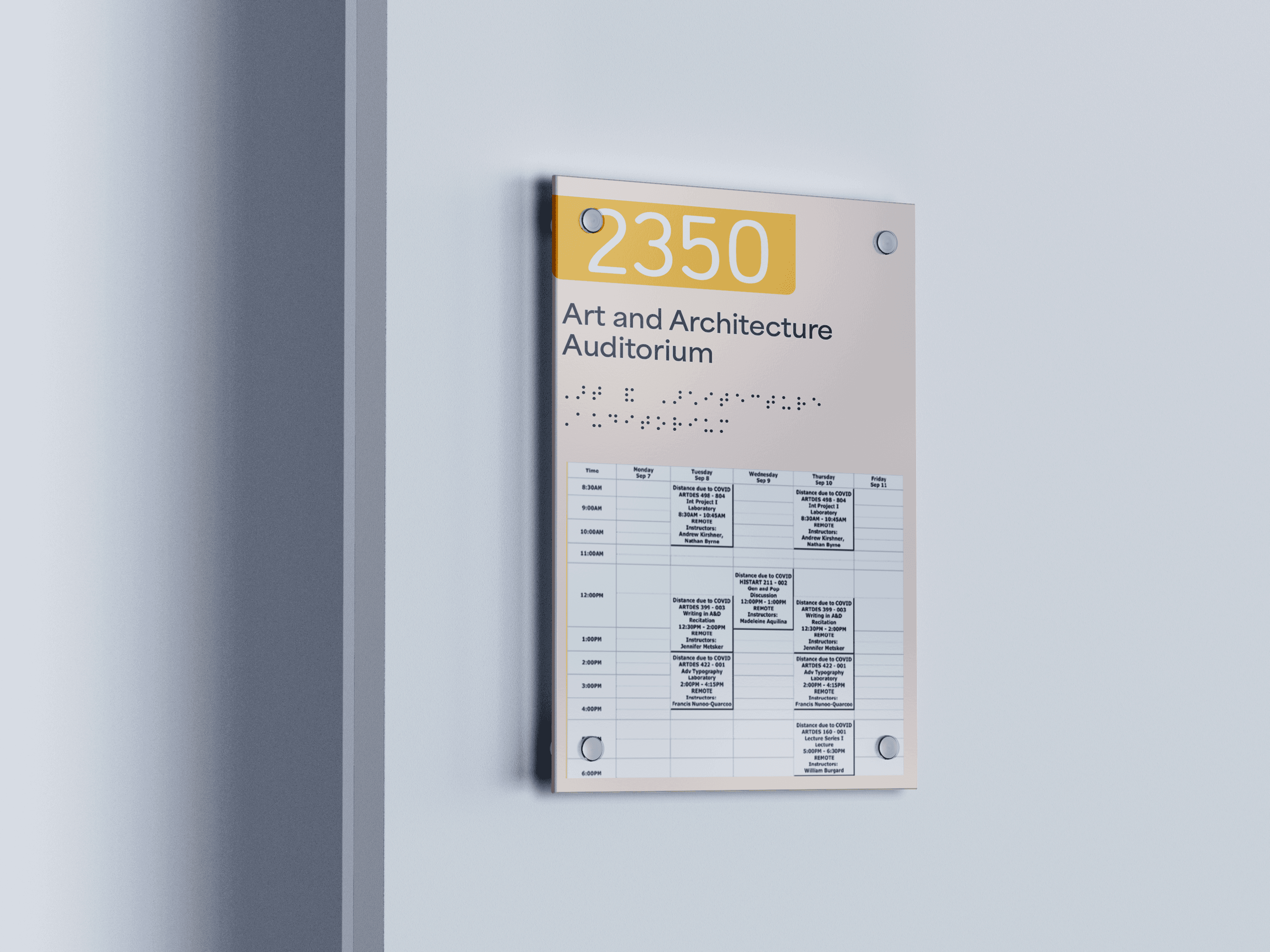
Signage- Locational
Signage- Locational
For the resources and shared areas, first is the room name, room number and braille. For the studios and classroom, first is the room number followed by name and braille. Underneath will be the schedule of classes running. Pink is for studios,orange for resources, blue for administration, grey is for taubman and yellow is for shared spaces.
For the resources and shared areas, first is the room name, room number and braille.For the studios and classroom, first is the room number followed by name and braille. Underneath will be the schedule of classes running. Pink is for studios,orange for resources, blue for administration, grey is for taubman andyellow is for shared spaces.
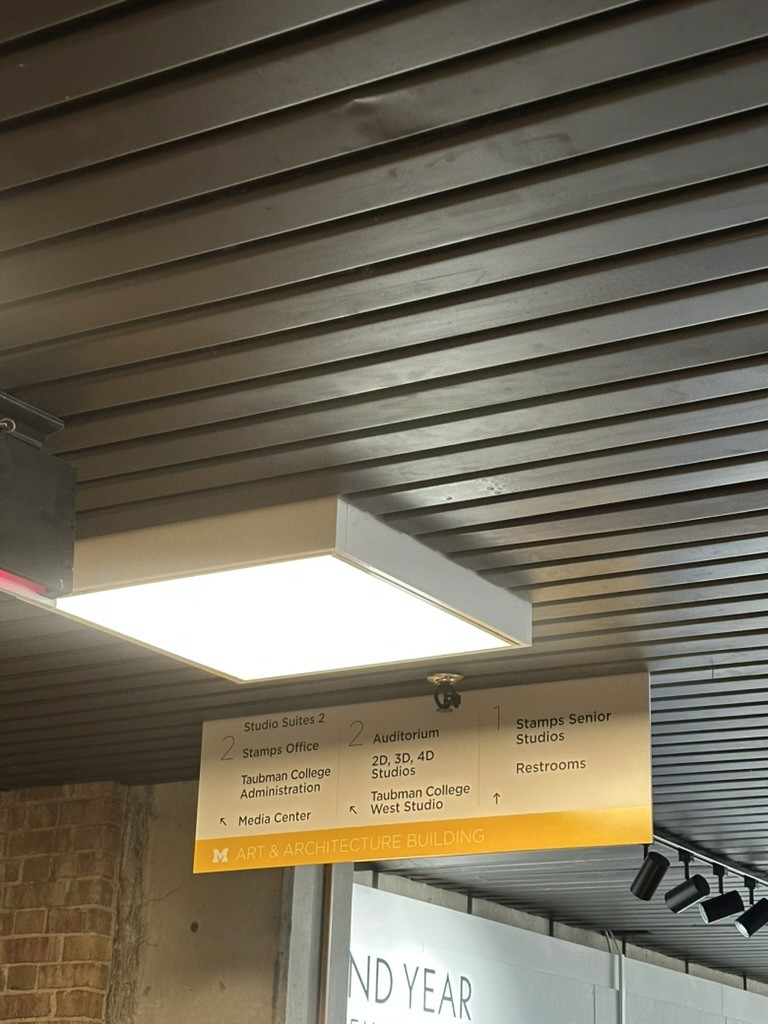
Signage- Directional
Signage- Directional
For the directional signage, first is the hall signage which acts like smaller individual signs for that specific part of the building. Stair signage is to provide information for where the stairs are leading and what rooms will come. Overhead signs for transitional information in the major corridors of the building
For the resources and shared areas, first is the room name, room number and braille.For the studios and classroom, first is the room number followed by name and braille. Underneath will be the schedule of classes running. Pink is for studios,orange for resources, blue for administration, grey is for taubman andyellow is for shared spaces.


